Customize Blocks Rendering
Whether you want to customize the look and feel of a core WordPress block, implement a custom block, or add a block from a third-party plugin, Faust.js makes it easy to render WP blocks to your liking. This guide will show you how to render a block in your Faust.js project.
0. Prerequisites
Ensure that you have completed the steps in our Rendering blocks guide and have WordPress blocks rendering in your app successfully before proceeding with the steps below.
1. Choose a block to override
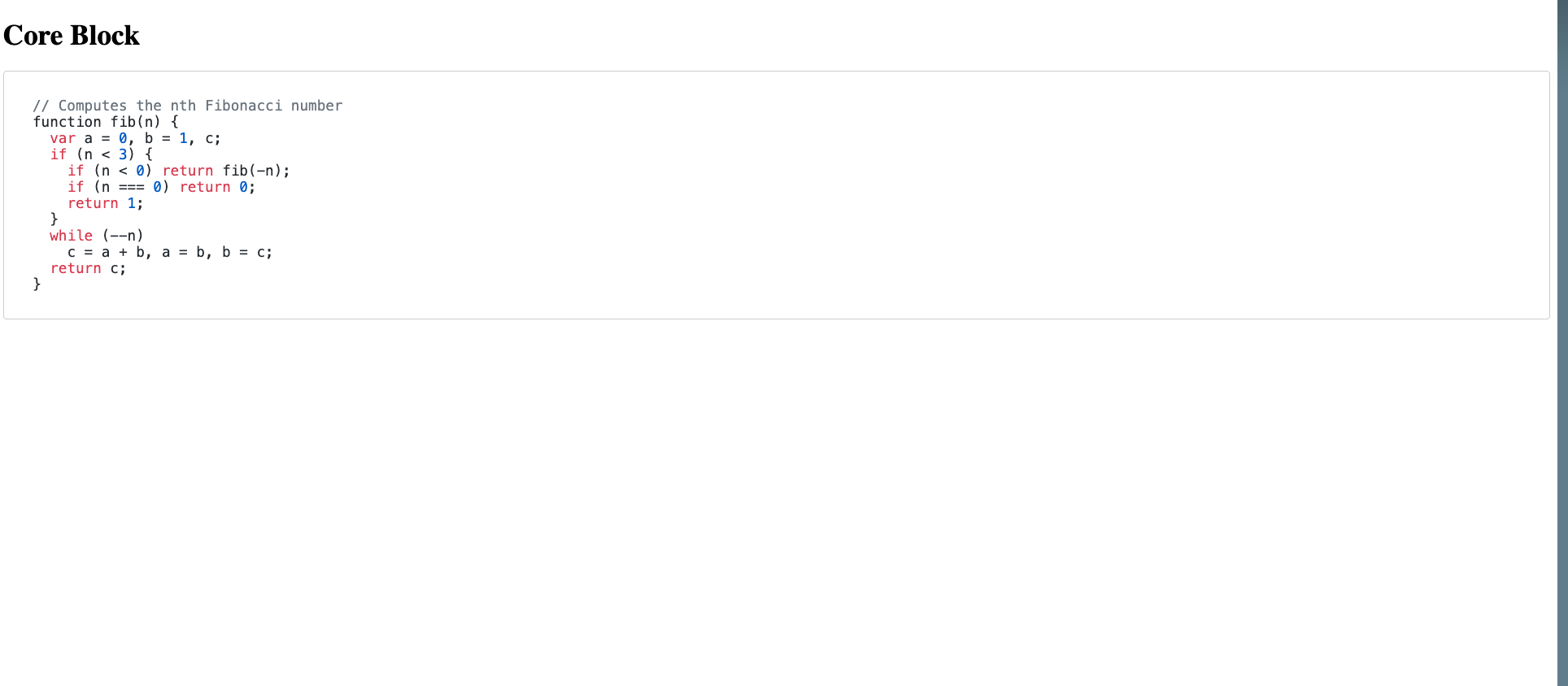
For this guide, we are going to override the core WordPress Code Block that renders a formatted block of code..
2. Review block features and settings
Try using the block yourself in the WordPress block editor and get familiar with the features it has. Review the settings it has in the Settings Panel and change a few of them to see what they do.
3. Inspect the block data via the GraphiQL IDE
In the WordPress admin sidebar, go to GraphQL > GraphiQL IDE to open the GraphiQL IDE. If you’re not familiar, this is a tool we can use for composing and testing GraphQL queries. This can help you understand what data your frontend app will receive when it executes a particular query.
Paste the following query into the GraphiQL IDE and hit the ▶️ button to execute the query. Replace /posts/testing with the path to the blog post that contains the block you want to override.
{
	post(id: "/posts/testing", idType: URI) {
		editorBlocks {
			renderedHtml
			... on CoreCode {
				attributes {
					borderColor
					backgroundColor
					content
					style
					textColor
					fontSize
				}
			}
		}
	}
}Each block is given a unique GraphQL type. In this case, the Core Code block is a type of CoreCode. You can find the block type by looking at the __typename field. If you need help figuring this out, the following query will list all the blocks on a post with their types:
{
	post(id: "/posts/testing", idType: URI) {
		editorBlocks {
			__typename
			type
			name
		}
	}
}
The __typename or type fields will show you the block type for each block on a post. You may find it useful to know this is generated from the $block_type argument in the block’s registerBlockType function; shown here in the name field.
The GraphiQL IDE will then display the data that was returned in the response to that query. It should look something like the example response below.
{
"data": {
"post": {
"editorBlocks": [
{
"renderedHtml": "\n<pre class=\"wp-block-code has-border-color has-tertiary-background-color has-text-color has-background has-small-font-size\" style=\"border-color:#333333;border-width:2px;color:#333333\"><code>// Computes the nth Fibonacci number\nfunction fib(n) {\n var a = 0, b = 1, c;\n if (n < 3) {\n if (n < 0) return fib(-n);\n if (n === 0) return 0;\n return 1;\n }\n while (--n)\n c = a + b, a = b, b = c;\n return c;\n}</code></pre>\n",
"attributes": {
"borderColor": null,
"backgroundColor": "tertiary",
"content": "// Computes the nth Fibonacci number\nfunction fib(n) {\n var a = 0, b = 1, c;\n if (n < 3) {\n if (n < 0) return fib(-n);\n if (n === 0) return 0;\n return 1;\n }\n while (--n)\n c = a + b, a = b, b = c;\n return c;\n}",
"style": "{\"color\":{\"text\":\"#333333\"},\"border\":{\"color\":\"#333333\",\"width\":\"2px\"}}",
"textColor": null,
"fontSize": "small"
}
}
]
}
}
}You can try modifying the query and running it again to see how the response changes. To learn about the fields that are available for that block, click the Docs link in GraphiQL, search for CoreCode, and click on CoreCodeAttributes. You will see the following:
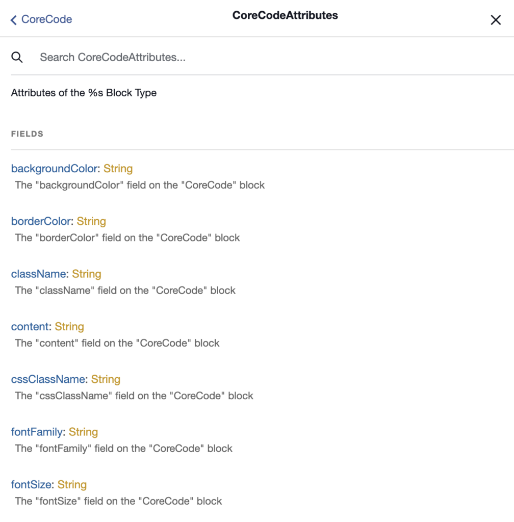
Styles
Notice that with some of the attributes like backgroundColor, the editor used the theme.json palette slug name instead of the actual value, i.e., tertiary. It also stored the custom hardcoded styles in the style fields as a JSON string.
4. Define the block in your frontend app
A. Create a new block component
Create a new CoreCode.js file inside of your wp-blocks folder that contains the following code.
export default function CoreCode(props) {
	console.log(props.attributes);
	return <div>CoreCode</div>;
}

CoreCode.displayName = "CoreCode";
For now, we’re just rendering a placeholder div and logging the data to the console. This will be replaced with actual block code in subsequent steps.
Context
The displayName property is defined here so that when we run the editorBlocks query in subsequent steps, the __typename field in the query will match this string. This is required so that the WordPressBlocksViewer component can resolve and render the block properly.
B. Register the new block component
Open the index.js file inside the wp-blocks folder and add your new block like this:
import { CoreBlocks } from "@faustwp/blocks";
import CoreCode from "./CoreCode";

export default {
	...CoreBlocks,
	CoreCode: CoreCode, // [++code]
};
Context
This file will be used to import all of the blocks you’re overriding and make them available as the default export, which will be passed into WordPressBlocksProvider in a subsequent step.
We also define the name of the block as CoreCode (the property name to the left of the ”:” character). This key must match the __typename value that the blocks has in the GraphQL schema.
C. Create the block GraphQL fragment
Create a fragment that describes the request block fields and attributes. First, import { gql } from @apollo/client. Then add the CoreCode.fragments code block, as shown below. Include all relevant fields for your implementation.
import { gql } from "@apollo/client";

export default function CoreCode({ attributes }) {
	console.log(attributes);
	return <div>CoreCode</div>;
}

CoreCode.fragments = {
	key: `CoreCodeBlockFragment`,
	entry: gql`
		fragment CoreCodeBlockFragment on CoreCode {
			attributes {
				borderColor
				backgroundColor
				content
				style
				textColor
				fontSize
				fontFamily
				cssClassName
			}
		}
	`,
};
Context
Attaching the fragment as a property of the function component (CoreCode.fragments = ...) is a convention that Faust.js uses to colocate fragments with the components that use them.
D. Include the block fragment in your page template queries
Now, you can include the block fragment inside of the GraphQL query for your posts and pages.
The example below shows a /wp-templates/single.js template.
import { gql } from "@apollo/client";
import blocks from "../wp-blocks";

export default function Page(props) {
	// ...
}

Page.query = gql`
  ${blocks.CoreCode.fragments.entry}
  query GetPost {
    post(id: $databaseId, idType: DATABASE_ID, asPreview: $asPreview) {
      editorBlocks {
        name
        __typename
        renderedHtml
        id: clientId
        parentClientId
        ...${blocks.CoreCode.fragments.key}
      }
    }
  }
`;
import blocks from "../wp-blocks";imports the blocks we’re overriding.${blocks.CoreCode.fragments.entry}interpolates theCoreCodeGraphQL fragment into the page query....${blocks.CoreCode.fragments.key}tells GraphQL to insert theCoreCodeGraphQL fragment inside of theeditorBlocks { ... }block.
With this code in place, when the GraphQL query for the single page template is executed, the response will now include data for the CoreCode block. You can follow this pattern in your other page templates to query for block data within them, as well.
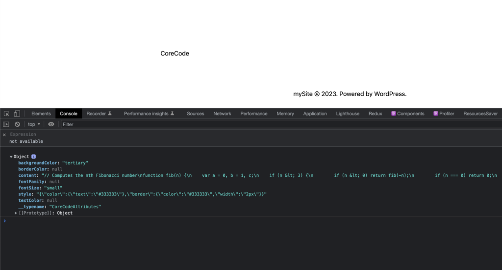
E. Verify the block data in the frontend app
If you navigate to the page that contains this block, you should be able to inspect the properties in the console and see your block attributes that were logged by console.log(props.attributes) in CoreCode.js.
5. Implement the block
You now have the block data available in your frontend app and are ready to implement the block’s structure, styling, and functionality.
You’ve done the hard work of getting the data into your app and integrating with the @faustwp/blocks package. How you implement this block is completely up to you. You can use any React component library, CSS-in-JS solution, or custom styles you like.
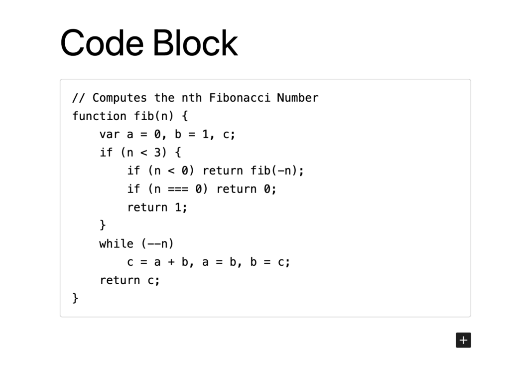
Keep in mind, If your implementation deviates from the WordPress implementation, your content editors might find this confusing. For this guide, we’ll show you a basic implementation of the CoreCode block.
Replace the CoreCode component with the following code. This code will render the block in the frontend app with a similar structure to the WordPress block editor.
import { gql } from "@apollo/client";

export default function CoreCode({ attributes }) {
	return (
		<pre className={attributes?.cssClassName}>
			<code>{`${attributes?.content}`}</code>
		</pre>
	);
}

CoreCode.fragments = {
	key: `CoreCodeBlockFragment`,
	entry: gql`
		fragment CoreCodeBlockFragment on CoreCode {
			attributes {
				content
				cssClassName
			}
		}
	`,
};

CoreCode.displayName = "CoreCode";
6. Implement the block styles
Let’s add some code highlighting to this component to really make it pop.
We’re going to leave the specific styling up you. You can choose to statically style in here or you could leverage the other available attributes to style the block dynamically from the WordPress block editor. Faust does support styling blocks using your WordPress Block theme styles.
A. Install the highlight.js package by running the following command:
npm add highlight.jsB. Import the highlight.js package in the _app.js file:
// THIS IS VERY IMPORTANT.
// In Next.js, put this in your _app.js file
import "highlight.js/styles/github.css";
C. Update the Component
Update CoreCode.js with the code bellow to add code highlighting:
import { gql } from "@apollo/client";
import { useEffect, useRef } from "react";
import hljs from "highlight.js";

export default function CoreCode({ attributes }) {
	// Create a ref for the <code> element
	const codeRef = useRef(null);

	useEffect(() => {
		// Once the component has rendered, apply highlight.js to the code element
		if (codeRef.current) {
			hljs.highlightElement(codeRef.current);
		}
	}, [attributes?.content]);

	return (
		<pre className={attributes?.cssClassName}>
			<code
				ref={codeRef}
				dangerouslySetInnerHTML={{ __html: attributes?.content }}
			/>
		</pre>
	);
}

CoreCode.fragments = {
	key: `CoreCodeBlockFragment`,
	entry: gql`
		fragment CoreCodeBlockFragment on CoreCode {
			attributes {
				content
				cssClassName
			}
		}
	`,
};

CoreCode.displayName = "CoreCode";
7. Wrapping up…
Navigate to a page that contains the CoreCode block and you should see the code block with syntax highlighting applied.